Mastering StoreKit 2. SubscriptionStoreView in SwiftUI.
This week we will continue the series of posts about StoreKit views in SwiftUI by covering another StoreKit view called SubscriptionStoreView. This view allows us to easily display and handle subscriptions in a single group.
Compare designs, show rulers, add a grid, quick actions for recent builds. Create recordings with touches & audio, trim and export them into MP4 or GIF and share them anywhere using drag & drop. Add bezels to screenshots and videos. Try now
Basics
The SubscriptionStoreView provides a complete subscription management flow in a single line of code.
import SwiftUI
import StoreKit

struct ContentView: View {
    var body: some View {
        SubscriptionStoreView(groupID: "598392E1")
    }
}
All you need is to place an instance of the SubscriptionStoreView with a single parameter defining the subscription group. Ensure you provide the group identifier, not the group title or any other string. The SubscriptionStoreView completely handles subscription flow, including loading and purchasing products. You don’t need to do anything.
You can customize the list of subscriptions in the SubscriptionStoreView by providing a list of product identifiers for every subscription you want to include. Keep in mind that SubscriptionStoreView can handle only subscriptions in the same group.
struct ContentView: View {
    var body: some View {
        SubscriptionStoreView(productIDs: ["123456789", "987654321"])
    }
}
Another option is to provide a list of loaded instances of the Product type that StoreKit 2 uses to encapsulate a particular in-app purchase product.
To learn more about the basics of the StoreKit 2, take a look at my “Mastering StoreKit 2” post.
As I said before, the SubscriptionStoreView handles the subscription management flow completely. So it provides the user interface for upgrades, downgrades, crossgrades, etc. By default, it displays all available actions, but you can control the availability of the provided actions by using the visibleRelationships parameter.
struct ContentView: View {
    var body: some View {
        SubscriptionStoreView(groupID: "598392E1", visibleRelationships: .all)
    }
}
The visibleRelationships parameter is defined via the SubscriptionRelationship struct. It provides many ready-to-use options like upgrade, crossgrade, downgrade, and current.
struct ContentView: View {
    var body: some View {
        SubscriptionStoreView(groupID: "598392E1", visibleRelationships: .current)
    }
}
In the example above, we use the SubscriptionStoreView only to display the subscription the user has already subscribed for.
SubscriptionStoreView supports the storeButton view modifier allowing to set the visibility for a set of buttons provided by the store. To learn more take a look at my “Mastering StoreKit 2. ProductView and StoreView in SwiftUI” post.
Styling
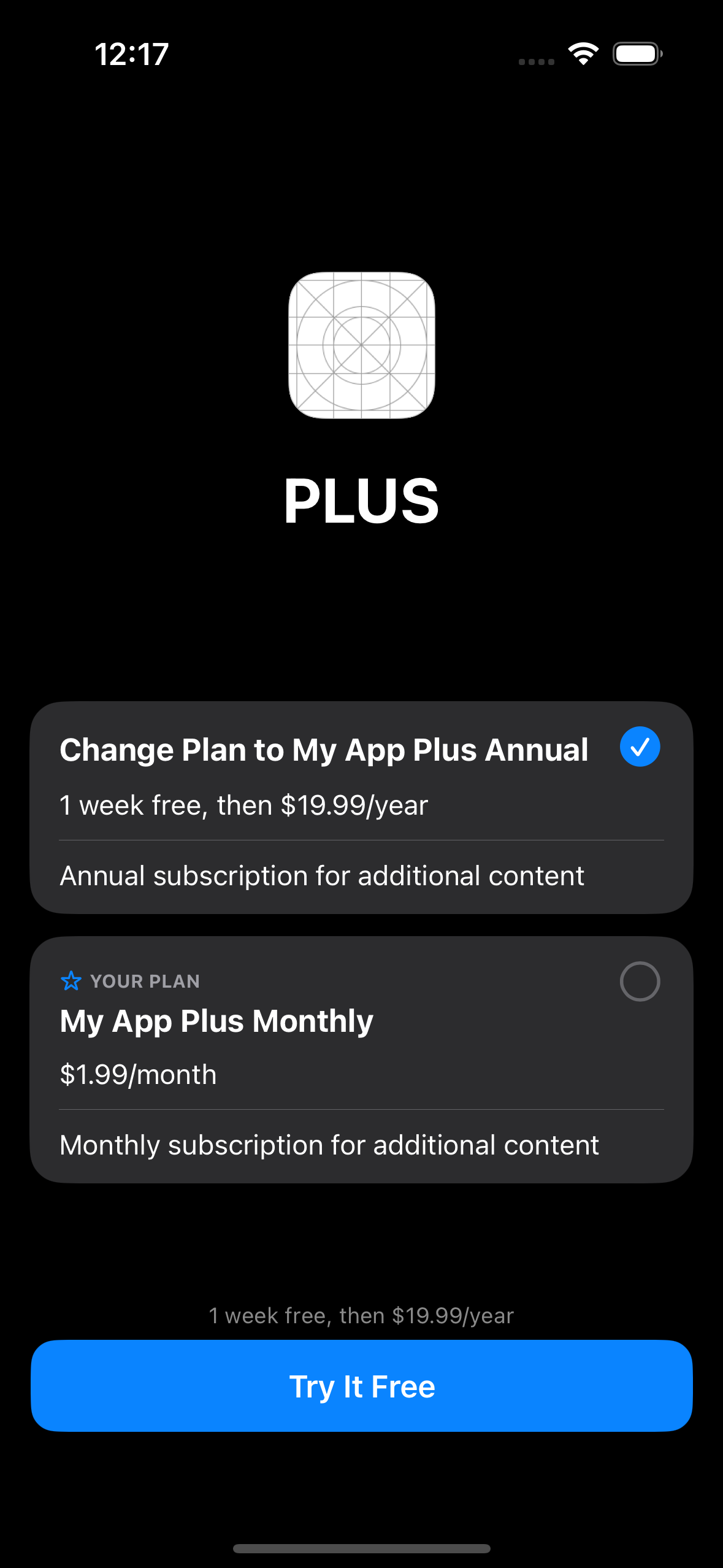
By default, SubscriptionStoreView uses the app icon and the title of the subscription group as additional content to display above the list of subscriptions. It works great for my apps on watchOS, but something other than what I want to show on iOS or iPadOS.
Fortunately, you can quickly provide your super custom view to display above the list of subscriptions. I usually use that area to give information on features included in the subscription.
struct ContentView: View {
    var body: some View {
        SubscriptionStoreView(groupID: "598392E1", visibleRelationships: .all) {
            MyMarketingContentView()
        }
    }
}
As you can see in the example above, we use another variant of the SubscriptionStoreView, allowing us to pass a ViewBuilder closure to display as marketing content.
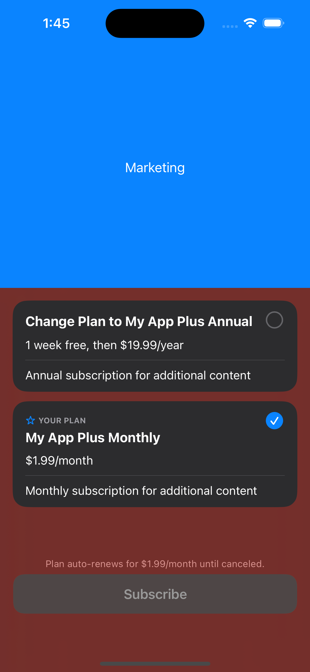
You can customize the background of the SubscriptionStoreView by using the brand-new containerBackground view modifier. It allows us to place a SwiftUI as a background of the SubscriptionStoreView.
struct ContentView: View {
    var body: some View {
        SubscriptionStoreView(groupID: "598392E1", visibleRelationships: .all) {
            MyMarketingContentView()
                .containerBackground(Color.blue, for: .subscriptionStoreHeader)
                .containerBackground(Color.red, for: .subscriptionStoreFullHeight)
        }
    }
}
As you can see, we can control the placement of the background by using the second parameter of the containerBackground view modifier. We can set different backgrounds for marketing content or the whole store view.
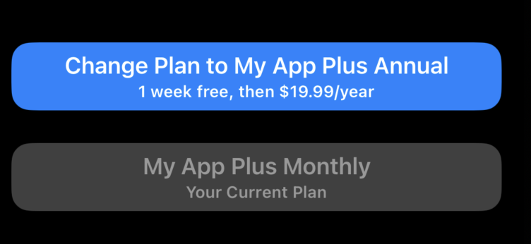
Another styling option SubscriptionStoreView provides us is the control style. By default, it uses pickers, but we can easily change it to use buttons instead by using the subscriptionStoreControlStyle view modifier.
struct ContentView: View {
    var body: some View {
        SubscriptionStoreView(groupID: "598392E1", visibleRelationships: .all)
            .subscriptionStoreControlStyle(.buttons)
    }
}
The subscriptionStoreControlStyle view modifier allows us to set the style to the following options: buttons, picker, prominent picker, and automatic. The SubscriptionStoreView works on all Apple platforms, but only some control styles work on some platforms. That’s why default is the automatic style that uses a different look and feel depending on the platform.
We also have the subscriptionStoreButtonLabel view modifier allowing us to customize store buttons. When you use pickers in your subscription store, the subscriptionStoreButtonLabel view modifier affects only a single button that calls to action.
struct ContentView: View {
    var body: some View {
        SubscriptionStoreView(groupID: "598392E1", visibleRelationships: .all)
            .subscriptionStoreButtonLabel(.multiline)
    }
}
The subscriptionStoreButtonLabel view modifier allows us to set different predefined labels for the call to action button. By default, it uses an automatic label that shows action based on the selected subscription. So it can display “Try free” when your subscription has a free trial or “Change to” when you already have an active subscription.
struct ContentView: View {
    var body: some View {
        SubscriptionStoreView(groupID: "598392E1", visibleRelationships: .all)
            .subscriptionStoreButtonLabel(.multiline)
    }
}
You can use the multiline option to include more information about your subscription in the button. Whenever you use the buttons style as the subscription control, the subscriptionStoreButtonLabel view modifier affects that buttons also.
This week we learned about the SubscriptionStoreView from StoreKit 2 and how to use it to make a recurring revenue for your app. I hope you enjoy the post. Feel free to follow me on Twitter and ask your questions related to this post. Thanks for reading, and see you next week!
- Mastering StoreKit 2
- Mastering StoreKit 2. ProductView and StoreView in SwiftUI.
- Mastering StoreKit 2. SubscriptionStoreView in SwiftUI
- Mastering StoreKit 2. SwiftUI view modifiers.
- StoreKit testing in Swift