Mastering StoreKit 2. ProductView and StoreView in SwiftUI.
We started a series of posts about StoreKit 2 last week. We learned the basics of StoreKit 2 and how easily we can monetize our apps. This week, we will continue the topic by learning about StoreKit views in SwiftUI. The StoreKit 2 introduces SwiftUI views, allowing us to quickly build paywalls or digital product shop screens.
Compare designs, show rulers, add a grid, quick actions for recent builds. Create recordings with touches & audio, trim and export them into MP4 or GIF and share them anywhere using drag & drop. Add bezels to screenshots and videos. Try now
StoreKit 2 provides the ProductView type allowing us to display and handle in-app purchases for a single product easily. All you need to do is to place an instance of the ProductView with the particular product id in the view hierarchy.
struct ContentView: View {
    var body: some View {
        ProductView(id: "55667744")
    }
}

As you can see in the example above, we can place an instance of the ProductView in a single line of code, but this line hides the complexity of loading and purchasing products from the App Store. StoreKit provides us with a set of styles to display a product in different appearances. We can use the productViewStyle view modifier to attach a particular style. StoreKit uses the automatic style by default, but we can use large, regular, or compact styles.
struct ContentView: View {
    var body: some View {
        ProductView(id: "55667744")
            .productViewStyle(.compact)
    }
}
You can also enable the presentation of the promoted image if uploaded to the App Store servers. The ProductView’s initializer has another parameter called prefersPromotionalIcon. You can use it to display the promoted icon.
struct ContentView: View {
    var body: some View {
        ProductView(id: "55667744", prefersPromotionalIcon: true)
    }
}
You might need to draw a custom SwiftUI view instead of promoted image for a product, and it is possible by using another overload of the ProductView initializer.
ProductView(id: "55667744") { _ in
    Image(systemName: "crown")
        .resizable()
        .scaledToFit()
    } placeholderIcon: {
        ProgressView()
    }
    .productViewStyle(.large)
As you can see in the example above, you can handle different loading states of promotional image and replace it with your own SwiftUI view if needed.
Another option is to build a completely custom product presentation by introducing a custom type of style. In this case, we must create a type conforming to the ProductViewStyle protocol.
struct CustomProductStyle: ProductViewStyle {
    func makeBody(configuration: Configuration) -> some View {
        switch configuration.state {
        case .loading:
            ProgressView()
        case .success(let product):
            Button {
                configuration.purchase()
            } label: {
                VStack {
                    Text(verbatim: product.displayName)
                        .font(.headline)
                    Text(verbatim: product.displayPrice)
                }
            }
            .buttonStyle(.borderedProminent)
        default:
            Text("Something goes wrong...")
        }
    }
}

struct ContentView: View {
    var body: some View {
        ProductView(id: "55667744")
            .productViewStyle(CustomProductStyle())
    }
}
As you can see in the example above, we define the CustomProductStyle type conforming to the ProductViewStyle protocol. The ProductViewStyle protocol has the only requirement, which is the makeBody function. The makeBody function has the parameter of type ProductViewStyleConfiguration, providing us with all the needed information about the product, loading state, and purchase functionality.
We can use different product styles to build the layout we need. Let’s make a paywall screen displaying subscription options among the lifetime in-app purchases.
struct ContentView: View {
    var body: some View {
        ScrollView {
            ProductView(id: "55667744") { _ in
                Image(systemName: "crown")
                    .resizable()
                    .scaledToFit()
            } placeholderIcon: {
                ProgressView()
            }
            .productViewStyle(.large)

            VStack(spacing: 16) {
                ForEach(["123456789", "987654321"], id: \.self) { id in
                    ProductView(id: id)
                        .productViewStyle(.compact)
                }
            }
            .padding()
        }
    }
}
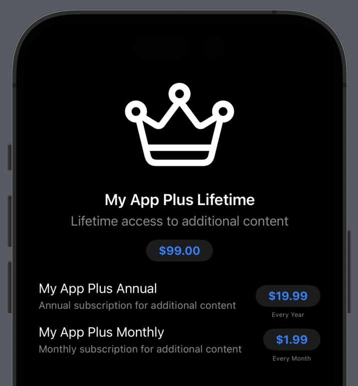
As you can see, we use different style options to display the list of available in-app purchases just in a few lines of code. And the UI we build supports purchasing and observes refunds automatically. But StoreKit views in SwiftUI don’t stop here. It provides us with the StoreView view displaying the collection of products in different layouts depending on the available space.
struct ContentView: View {
    var body: some View {
        ScrollView {
            ProductView(id: "55667744") { _ in
                Image(systemName: "crown")
                    .resizable()
                    .scaledToFit()
            } placeholderIcon: {
                ProgressView()
            }
            .productViewStyle(.large)

            StoreView(
                ids: [
                    "123456789",
                    "987654321"
                ]
            )
            .productViewStyle(.compact)
        }
    }
}
The StoreView displays the layout of a collection of products. For example, on tvOS StoreView uses a grid to show the products. You can still customize the look and feel of the products displayed in the StoreView by applying the productViewStyle view modifier to the StoreView.
struct ContentView: View {
    var body: some View {
        ScrollView {
            ProductView(id: "55667744") { _ in
                Image(systemName: "crown")
                    .resizable()
                    .scaledToFit()
            } placeholderIcon: {
                ProgressView()
            }
            .productViewStyle(.large)

            StoreView(
                ids: [
                    "123456789",
                    "987654321"
                ]
            )
            .productViewStyle(.compact)
            .storeButton(.visible, for: .restorePurchases)
        }
    }
}
The StoreView provides a set of buttons like restore transactions or paywall cancellation buttons out of the box. You can manipulate the visibility of a particular button by using the storeButton view modifier.
To learn more about the basics of the StoreKit 2, take a look at my “Mastering StoreKit 2” post.
Today we learned about SwiftUI views that StoreKit 2 provides us to build paywalls in our apps. I hope you enjoy the post. Feel free to follow me on Twitter and ask your questions related to this post. Thanks for reading, and see you next week!
- Mastering StoreKit 2
- Mastering StoreKit 2. ProductView and StoreView in SwiftUI.
- Mastering StoreKit 2. SubscriptionStoreView in SwiftUI
- Mastering StoreKit 2. SwiftUI view modifiers.
- StoreKit testing in Swift