Content margins in SwiftUI
SwiftUI introduced a set of view modifiers, allowing us to manage the safe area in our views efficiently. In many cases, the safe area is where you want to put your content. Today, we will learn about the new content margin concept that SwiftUI introduced and how it differs from the safe area.
Compare designs, show rulers, add a grid, quick actions for recent builds. Create recordings with touches & audio, trim and export them into MP4 or GIF and share them anywhere using drag & drop. Add bezels to screenshots and videos. Try now
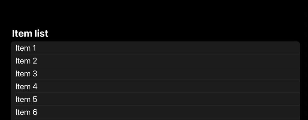
Let’s start with a simple example demonstrating the list with a hundred items.
struct ContentView: View {
    var body: some View {
        NavigationStack {
            List {
                ForEach(1..<100) { index in
                    Text("Item \(index)")
                }
            }
            .font(.title)
            .navigationTitle("Item list")
        }
    }
}
As you can see in the example above, we place the List view with a bunch of Text views inside. It might look great on an iPhone, but it seems very strange on an iPad, as it places all the text on the leading edge and keeps the center of the screen empty.
While using UIKit, we have access to the readableContentGuide layout guide. Literally, it is another safe area that adapts to the screen size, but only for your text content. Unfortunately, we don’t have access to readableContentGuide in SwiftUI.
To learn more about managing safe area in SwiftUI, take a look at my “Managing safe area in SwiftUI” post.
We can workaround the issue by increasing the safe area on the iPad like this:
struct ContentView: View {
    @Environment(\.horizontalSizeClass) private var sizeClass

    var body: some View {
        NavigationStack {
            List {
                ForEach(1..<100) { index in
                    Text("Item \(index)")
                }
            }
            .font(.title)
            .navigationTitle("Item list")
            .safeAreaPadding(.horizontal, sizeClass == .regular ? 200 : 0)
        }
    }
}
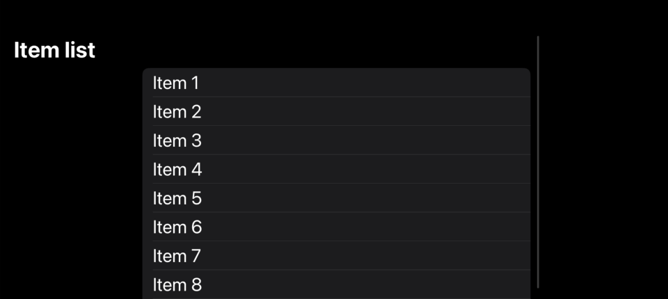
We were able to shift the content to the center on the iPad by using the horizontalSizeClass environment value and the safeAreaPadding view modifier. However, as you can see, this also shifts the scrollbar indicator from the trailing edge to the center.
We need a way to differentiate the content and toolbars of the view and shift only the content while keeping the toolbars in the same place. Fortunately, SwiftUI introduces the new contentMargins view modifier, allowing us to shift a particular type of content in the view.
struct ContentView: View {
    @Environment(\.horizontalSizeClass) private var sizeClass

    var body: some View {
        NavigationStack {
            List {
                ForEach(1..<100) { index in
                    Text("Item \(index)")
                }
            }
            .font(.title)
            .navigationTitle("Item list")
            .contentMargins(
                .horizontal,
                sizeClass == .regular ? 200 : 0,
                for: .scrollContent
            )
        }
    }
}
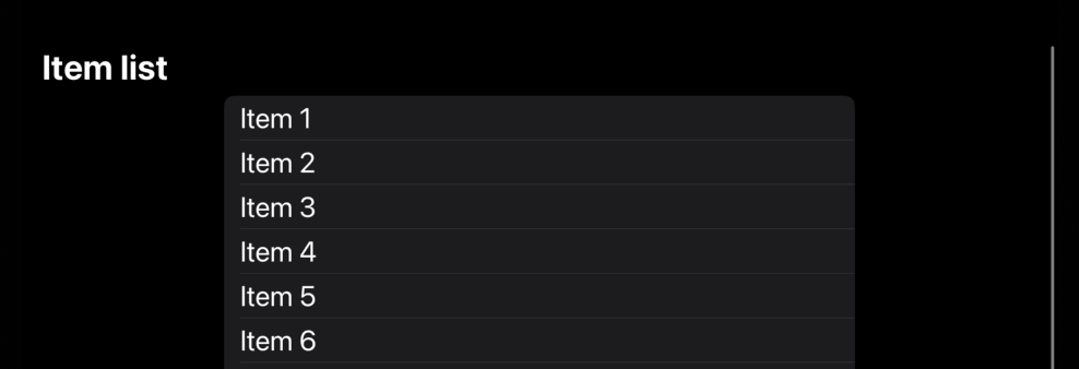
As you can see in the example above, we use the contentMargins view modifier to shift only scrollable content away from the safe area. But it keeps the scrollbar on the trailing edge of the view.
The contentMargins view modifier accepts a few parameters, allowing us to tune its behavior. The first parameter is the edge we want to shift. It might be leading, trailing, top, horizontal, vertical, or all at once. The second parameter is the amount of space we want to shift. The third parameter is an instance of the ContentMarginPlacement type, which allows us to specify the place we want to shift. For example, it might be the scrollContent as we do in our example. Another option is scrollIndicators, which only shifts the indicator.
Today, we learned about the new contentMargins view modifier. It is a crucial piece of the safe area management that was missing before in SwiftUI. Finally, we have a way to manage it and make our apps even more accessible and adaptable for different screen sizes. I hope you enjoy the post. Feel free to follow me on Twitter and ask your questions related to this post. Thanks for reading, and see you next week!